A highly customisable circular slider written in QML.
Following is the list of properties of the Circular Slider.
- trackWidth
- progressWidth
- handleWidth
- handleHeight
- handleRadius
- startAngle
- endAngle
- minValue
- maxValue
- value
- angle [readonly]
- capStyle
- trackColor
- progressColor
- handleColor
- stepSize
- snap
- handle [Component]
- pressed [readonly]
- hideTrack
- hideProgress
I have seen many Circular Dial implementation which were either written in C++ or using Canvas in QML. I thought of creating my own component where I can provide option to make it more customisable so that it can be used in all kind of applications.
I have decided to use Qt Quick Shapes to create the track and progress same as what I have done for my last component Circular Progress Bar. And provide customisation option not only limited to colors but also other properties like handle.
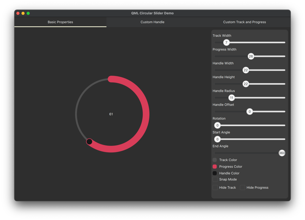
Let’s have look the anatomy of the Slider. Below is the image of the CircularSlider with basic properties.

- The Track and Progress are created using Shape component with PathAngleArc.
- Default handle is rounded rectangle which is loaded using a Loader inside the handleItem. By setting the property z to 2 we make sure that the handle is rendered always on top when we use any child item inside the slider for progress indicator.
- A MouseArea is used which covers the whole component but only accepts mouse clicks along the slider track with a given minimum width.
- A QtObject which is used to hide the internal details of the component from outside. This is the object inside which we hide all the internal properties and functions which are used for calculations.
Demo Screenshots


SOURCE CODE:
https://github.com/arunpkqt/RadialBarDemo
CircularSlider is now available in Qt Marketplace. https://marketplace.qt.io/products/circularslider
 Arun's Qt Corner
Leave a comment