Radial Bar is a highly customizable QML component created using QQuickPaintedItem class.
This is a useful component to be used for any QML application to show the status of progress.
Following are the list of main properties supported by this component.
- startAngle
- spanAngle
- minValue
- maxValue
- value
- dialWidth
- backgroundColor
- foregroundColor
- progressColor
- textColor
- penStyle
- suffixText
- showText
- dialType
- textFont
The property penStyle can be used to provide two styles which Qt is providing which are Qt::FlatCap & Qt::RoundCap.
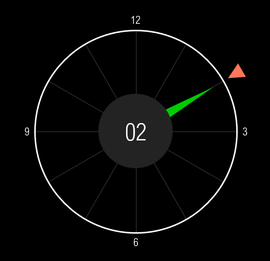
The property DialType is provided as custom enum which will have following properties.
- FullDial
- MinToMax
- NoDial
Below is the sample usage of RadialBar component.
RadialBar {
     width: 300
     height: 300
     penStyle: Qt.RoundCap
     dialType: RadialBar.FullDial
     progressColor: "#1dc58f"
     foregroundColor: "#191a2f"
     dialWidth: 30
     startAngle: 180
     spanAngle: 70
     minValue: 0
     maxValue: 100
     value: 50
     textFont {
         family: "Halvetica"
         italic: false
         pointSize: 16
     }
     suffixText: "%"
     textColor: "#FFFFFF"
}
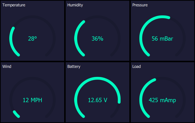
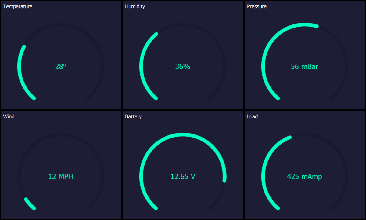
Screenshots:


Source code:
https://github.com/arunpkqt/RadialBarDemo
New version of RadialBar rewritten using Qt Quick Shape is now available here,
https://github.com/arunpkqt/RadialBarDemo/blob/master/RadialBarShape.qml
This can be used a s a drop-in replacement for the previous RadialBar component.
Related latest blog post is available here
Update:
A port of QML RadialBar using PyQt is available at,

 Arun's Qt Corner
Leave a comment